Natalie Mavrota
FICHE is a case study electronic music festival that takes place in Athens and introduces new names of the electronic scene and celebrates the old ones. With this project I wanted to create a dynamic identity and explore ways to communicate the electronic music genre.
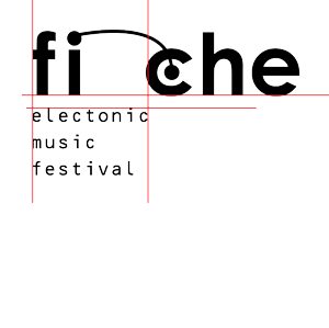
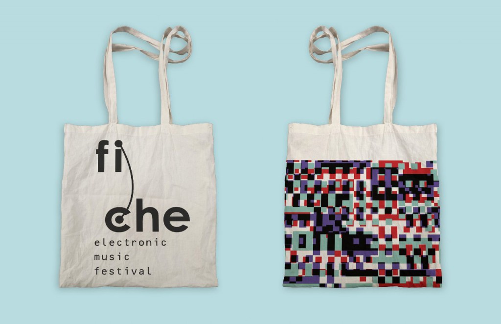
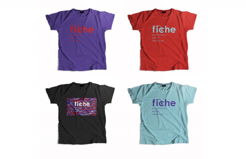
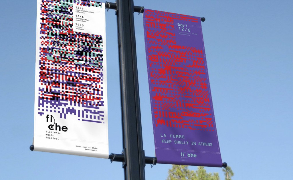
My inspiration for the name and the logotype of the festival came from the synthesizer. I named it FICHE after the French word for plug. This word is common to use in Greek to address to plugs, but the connection between electronics and the music is not there yet.
The logo has various versions to make its application easier for all the needs of the identity and to have a direct reference to its origins, the plugs on the synthesizer. On the same note, the fonts used in the identity are OCR-B 10 BT and Century Gothic bold, to give the feeling of the equipment for electronic music.
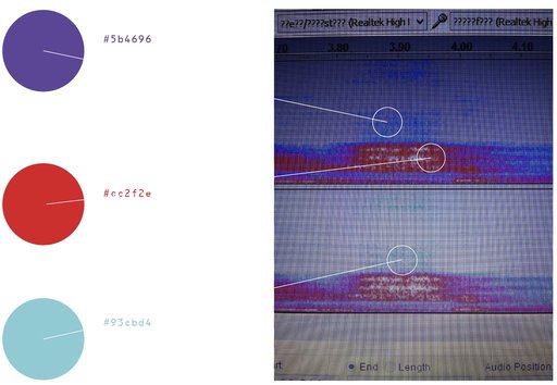
The other very important elements that give character to this identity are the colors and the pattern. The colors are inspired by the spectogram of the sound of the word FICHE. The pattern is created with databending. I recorded the word FICHE and exported the sound as a raw file. After much experimentation with this file in Photoshop, I concluded to the final pattern.
Links
Natalie Mavrota (Athens, 1994) is a graphic design student at TEI of Athens and studied at Faculdade de Belas Artes da Universidade do Porto with the Erasmus scholarship.
Jinyoung Park
This project uses a Processing program to change the Korean letterforms for Tic Toc Tic Toc:
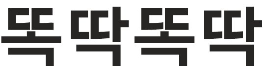
Changing every seconds, every minutes and every hours. Even with days! The type reflects time clock. Typography is not stationary at all. Typography can be interactive design.
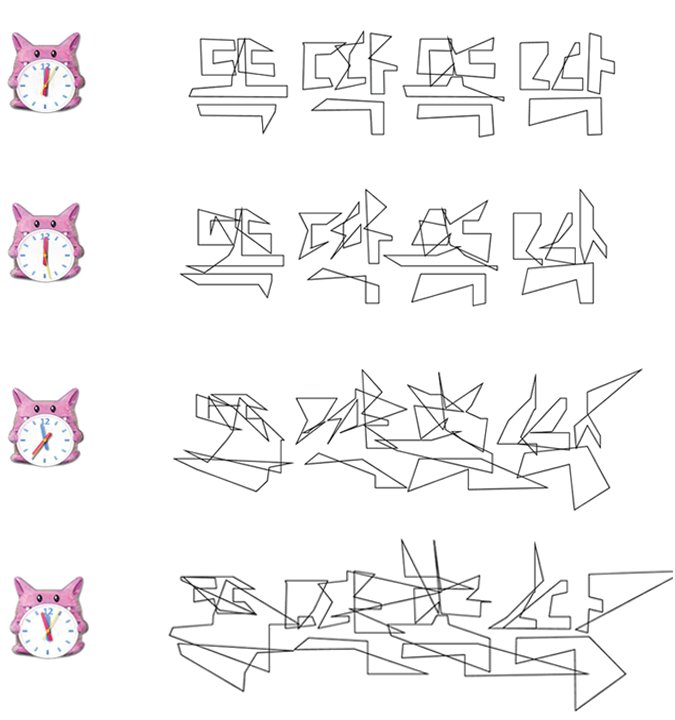
The interactive typography can be an abstract figure itself that we can use as a design source.
Jinyoung Park (Seoul, South Korea, 1994). Studying Design in Seoul National University of Science and Technology.
André Gonçalves
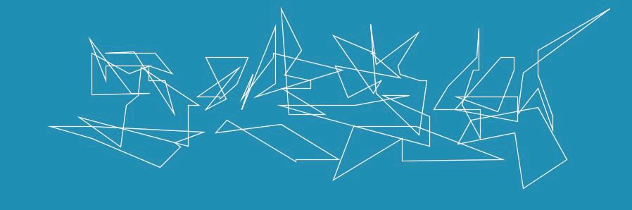
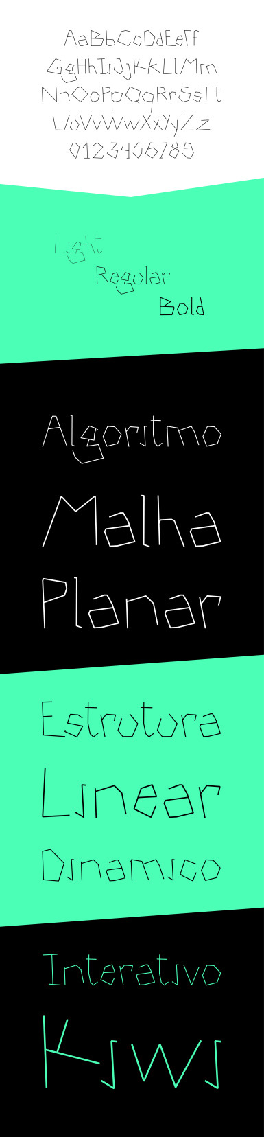
Este projeto é resultado de duas propostas de duas disciplinas diferentes, Laboratório de Som e Imagem e Design 1. Numa delas explorei o conceito de algoritmo e de regras que produzem resultados aleatórios; na outra produzi um alfabeto a partir de algo sem qualquer tipo de caracteres e onde estes normalmente não seriam encontrados.
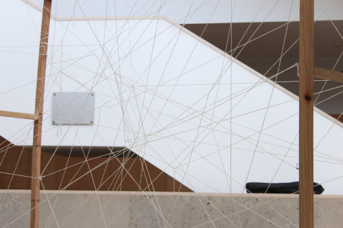
Para tal construí uma estrutura paralelepipedal em madeira na qual colocarei ganchos por todo o seu perímetro. O objetivo foi prender fios em direções aleatórias de uns ganchos aos outros, formando uma rede na qual, mais tarde, encontraria o meu alfabeto. Para tal, convidei qualquer pessoa a participar nesta instalação, fazendo parte dela mesma, na medida em que só existiria com a colaboração de todos.
https://www.youtube.com/watch?v=sss5rtHC7mQ
A instalação esteve situada no Pavilhão Sul da Faculdade de Belas Artes do Porto, desde segunda feira dia 01 de Junho até sexta feira dia 05, altura em que terminou. Em seguida, passei à fase de seleção dos caracteres a partir da rede de fios. Todo o processo foi documentado para melhor compreensão do projeto.
Links
André Gonçalves estuda Design de Comunicação na Faculdade de Belas Artes da Universidade do Porto.